You will examine one dataset that will allow you to explore disciplinary variation in the length of research articles. Because the main variables (total number of tokens and types in each research article) are continuous, they lend themselves to common descriptive statistics, a variety of graphs, a simple parametric statistic (t-test), and correlation statistics (Pearson product-moment correlation and its non-parametric alternative Spearman’s rank order correlation).
You will investigate three main research questions:
1. Are research articles as long in the social sciences and humanities as in the life sciences?
2. Can we observe other disciplinary variations in research article length?
3. Is the number of tokens correlated with the number of types in research articles?
What to Include in your Final Report
Most of the instructions below are simply meant as a step-by-step guide for you to explore the data and “play with” SPSS.
Note. You will observe minor differences between the screen shots reproduced below and what you see on your monitor because of a few upgrades in the version of SPSS you will use.
STEP ZERO: Getting to know our dataset
1.1 Getting started: Setting options in SPSS for displaying tables and values
1. Download the “ACAD_CORP_DOCTORED.sav” database from cuLearn and save it into your P drive. (ACAD CORP stands for Academic Corpus; sav is the extension for SPSS database files)
2. Start SPSS.
3. Click on Edit from the menu at the top of the screen and then choose Options (From now on this type of instruction will be abbreviated as follows: Edit → Options). This will open the Options screen. Under the General tab, choose options as shown on the screen shot below. Make sure you check the “No scientific notation for small numbers in tables” box to prevent unfamiliar numbers (e.g., E-05) from appearing in tables. Under the Data tab, in the Display Format for New Numeric Variables, set the Decimal Places to 0 to simplify the appearance of the numbers shown (decimal places need not be displayed for the data used in this workshop). Under the Output tab (formerly the Output Labels tab as on the screen shot below), look for Pivot Table Labeling and Outline Labeling and match the settings as shown on the next screen shot. In particular, choose “Values and Labels” under “Variable values in labels shown as.” This will allow you to see both the numerical values and the explanatory labels in tables. Under the Pivot Tables tab, within TableLook, choose the Academic style in order to generate tables that are well formatted.
The few questions for which you must include an answer in your report will be signalled by a text box such as this one. Please identify the question number in your report.
Open the ACAD_CORP_DOCTORED database from within SPSS: File → Open → Data
4. Explore the database: Toggle between the Data View and the Variable View. Make sure you understand the data and variables, including number of data points (number of text files), types of measure (nominal, ordinal, scale), and the value assigned to each disciplinary domain.

1.2 Exploring the database using descriptive statistics and graphs
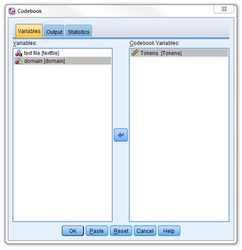
It is easy to make errors while inputting data. To help ensure there are no errors in the data files, or at least no out-of-range values on any of the variables, a recommended first step is to generate simple descriptive statistics. For a quick summary of the characteristics of the variables in your data file, a simple procedure is to generate a codebook report:
How: Analyze → Report → Codebook. Then select the continuous (ratio scale) variable “Tokens" as shown in the screen shot below.
What to look for in the output: Is there any data point missing? How different is the mean number of tokens from the median numbers of tokens? To what extent does this difference indicate that the Token variable is, or is not, normally distributed?
6. Before you go any further, practice saving the Output:?Save As → Save Output As. Give the Output file a meaningful name, e.g., Output_ACAD_CORP_DOCTORED. Make sure you save the Output onto your P drive. DO NOT SAVE ANY FILE ONTO THE DESKTOP OR THE C DRIVE OR ANY DRIVES YOU DO NOT RECOGNIZE. In the best case, you will not be authorized to save; in the worst case, you will not be able to retrieve the file even if you thought you were saving it. To make sure you get it right, close the Output file you just saved (it should have an spv extension) and then try to re-open it: File → Open → Output. REMEMBER TO BACK UP YOUR FILES BEFORE YOU LEAVE THE LAB. This means saving your files in more than one location, e.g., P drive, flash drive, in your DropBoxaccount, and in your email account (by emailing the files to yourself).
7. Now that you have explored the codebook for any obvious anomalies in your database, you can generate a more complete set of descriptive statistics for the Tokens variable. ?How: Analyze → Descriptive Statistics → Descriptives. Select Tokens as your Variable. Within Options, check all boxes except Sum as shown below.
Guillaume Gentil, Inquiry Strategies 5002, Winter 2016 4
Include this descriptive statistics table in your report with a caption (Make sure the caption is properly inserted so that you can later generate a list of tables in MS Word; you will have to squeeze the columns a bit to make the table fit within the page).
What to look for in the output: Try to understand the statistics provided. For instance, what is value of the range statistic for tokens?
What does it mean? Do the skewness and kurtosis statistics indicate that the token scores are normally distributed? (Remember that for a normal distribution, the value of skewness and kurtosis is zero; don’t worry too much about standard error although you can refer to Trochim, 2006 for help in interpreting it)
8. In your report, briefly comment on the descriptive statistics as you would in a formal research report or a thesis that would aim to investigate the length (in number of tokens) of academic research articles based on a corpus such as the ACAD CORP. Make sure you refer to the table in your commentary (e.g., “as shown in Table 1...”, “See Table 1”)
It is somewhat difficult to understand descriptive statistics without a graph. To visualize the distribution of token size across the corpus, the easiest is to generate a histogram and a boxplot.
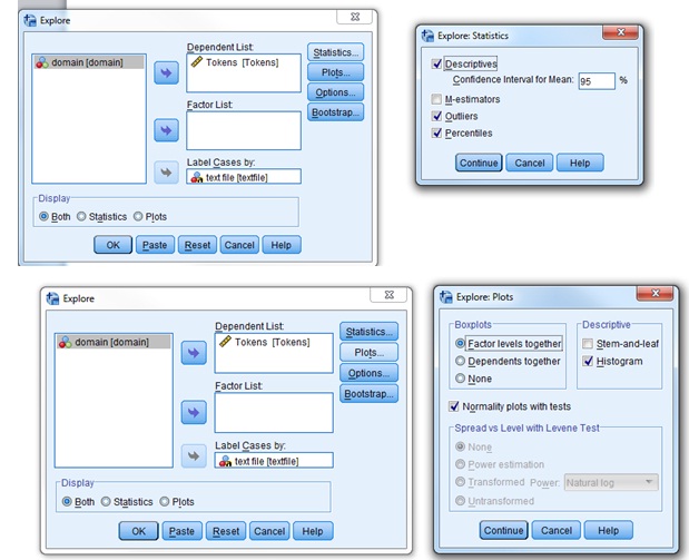
How: Analyze → Descriptive Statistics → Explore. Choose Tokens as Dependent List and Label Cases by textfile. Display both plot and statistics. Within Statistics: Check Descriptives (Confidence Interval for Mean: 95%), outliers, and percentiles. Within Plots: Uncheck Stem-and- leaf and check Histogram (don’t check other default values: “normality plots with tests” must be unchecked and boxplots should be set at “Factor levels together”). Within Options: Exclude cases pairwise.
What to look for in the output: To what extent does the distribution of the token values appear to be normally distributed? (To answer the latter question, in addition to the skewness and kurtosis statistics you generated previously, you should examine the overall shape of the histogram and compare the median and the mean, bearing in mind that the closer the median is to the mean, the more “normal” the distribution is. You should also look at the boxplot: does the median line divide the box into two equal parts? Are the whiskers symmetrical?).
1.3 Verifying if the distribution is normal (e.g,. for parametric testing)
9. The descriptive statistics, the histogram, and the boxplot suggest that the token values are normally distributed. If you want to make sure, you can run a normality test. Go back to Analyze → Descriptive Statistics → Explore and repeat exactly the same steps except that this time, Within Plots, you will check the “normality plots with tests” box.
How to interpret the tests of normality: The null hypothesis is that your data distribution is the same as the normal distribution (there is no difference between the normal distribution and the observed distribution). Ideally, you would NOT want to reject the null hypothesis, right? Therefore, this is a case where you would hope that the p value is higher than 0.05. What are the p values here for the Kolmogorov-Smirnov and Shapiro-Wilk tests of normality? Based on these p-values, would you conclude your values are normally distributed?
Another way to confirm normality is to examine the Normal Q-Q Plot of Tokens. The more the observed values aligned on the diagonal line, the closer they are to the values that would be expected if the distribution were normal. Is this the case here? (Just ignore the “Detrended Normal Q-Q Plot”).
Note. According to some experts, visual inspection (of the histogram, the boxplot, and the Q-Q Plot) is a better way of assessing normality than normality tests. Another question is also which normality might be most appropriate: Kolmogorov-Smirnov or Shapiro-Wilk? In our case, all these methods of assessing normality give the same consistent result, so let’s not worry too much about these subtleties.
RECAP THUS FAR. We have explored our data by means of descriptive statistics and graphs and assessed the normality of their distribution. Now that we have a better “feel” for our data, we can move on to what really interests us, research question 1: Are research articles as long in the social sciences and humanities as in the life sciences?
9. In your report, briefly explain summarize your findings from questions 8 and 9: Can you conclude that the token values are normally distributed? Based on what grounds?
Research Question 1: Are research articles as long in the social sciences and humanities as in the life sciences?
10. Comparing article lengths visually (using charts). We will now compare the average length (in number of tokens) of research articles across two domains: (1) life sciences and (2) social sciences and humanities. Before running appropriate inferential statistics (such as a t-test), let us visually inspect the distribution of values in each domain (does each distribution look like a normal distribution?) and then to compare these distributions across the two domains (how much do they overlap?)
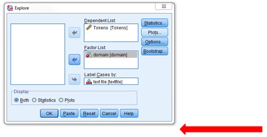
How: Generate a histogram and a boxplot as before with one modification: Add the Domain variable into the Factor List.]
What to look for in the output: 1) (in the histogram): the normality of the distribution of the values shown in the histograms (to decide whether or not parametric statistics can be used); 2) (in the boxplot): the median length of research articles in each disciplinary domain and the extent to which article length varies within and between the two domains.
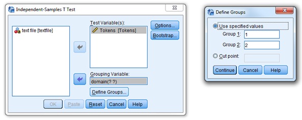
11. Comparing the mean length of articles in the social sciences and the life sciences with a t-test (comparing two means). In the boxplot, you have probably noticed that the median size of research articles in the social sciences is higher than that in the life sciences. Is this difference significant, however? To find out, you will run a t-test to compare the mean length of research articles in these two domains of academic inquiry. Based on your analyses in question 10, can we confidently use a parametric test such as a t-test? In other words, can the distribution of article lengths in each of these two disciplinary domains be approximated to a normal distribution? Assuming that the answer is yes, we will perform a t-test for two independent samples.
How: Analyze → Compare Means → Independent-Samples t-test. Select “tokens” as the Test Variable and “domain” as the Grouping Variable. You must specify which domains you want SPSS to run a t-test on (in this database there are only two!). Define Groups: The value for Group 1 is 1
In your report, include the boxplot with a caption and comment on it as you would in a formal research report such as an MA thesis: What does this tell you about variation in the length of research article both within and between disciplines based on the ACAD CORP? (life sciences) and for Group 2 is 2 (social sciences and humanities) (If you have forgotten the codes used, right click on the variable name and then choose Variable Information from the pop- up box that appears. This will list the codes and labels). Leave Options set as default. See screen shot below.
What to look for in the output? See Dörnyei’s textbook pp. 215-217 for guidance on how to interpret and report the results of a test-t. In particular, note that SPSS does NOT calculate the effect size. If you do find a statistically significant difference in the average size of articles in the social sciences and the life sciences, then you should calculate the effect size using the formula for the eta squared (η2) provided on page 217.
SAVING YOUR WORK IN A FORMAT YOU CAN RETRIEVE AT HOME
Make sure you have saved your latest SPSS Output document first in the spv format. This will allow you to re-open the output in SPSS. However, although you should be able to access SPSS from most computers on campus, you may want to work on your report at home. In order to do so, you have several options:
a) You can copy and paste any tables or charts into a MS Word document.
b) You can export the output as a doc file: File → Export. Choose Document Type: Word/RTF (*.doc) (One advantage of this method is that wide tables will be automatically divided up to fit the width of the page). This is probably the best option.
c) You can save the output of your analyses as an SPSS Web Report: File → Save As: Name the file in a way that makes sense to you and choose: Save as Type: SPSS Web Report (*.htm)
Whatever option(s), you choose, make sure you save your work on your P: drive, in a memory stick and/or in the clouds (e.g., Dropbox). Do not save anything in the C: drive in a computer lab.
11. Report the t-test result as you would in a MA thesis or a research article. See Dörnyei’s textbook pp. 217-218 for guidance.
Research Question 2: Can we observe variations in research article length between other disciplines?
Thus far, we have only compared two disciplinary domains (the life sciences and the social sciences) using a “doctored” i.e., simplified and “cleansed” dataset. We will now extend our comparison to five disciplinary domains and using a real dataset (which is much messier but also much more realistic). We will repeat many of the same steps as for research question 1 in order to compare the results.
12. Make sure you have saved your latest SPSS Output document. Close ACAD_CORP_DOCTORED and exit SPSS.
13. Reopen SPSS but this time load the ACAD_CORP_ACTUAL database. Quickly check and reset the setting if necessary (set 1.1 Getting Started above).
14. Save your new Output file (for Research Question 2 and 3) first in the SPSS format (.spv) and then, when you are done, in a format you can retrieve from home (see above).
15. Quickly explore this new database: Toggle between the Data View and the Variable View. Make sure you understand the data and variables, including number of data points (number of text files), types of measure (nominal, ordinal, scale), and the value assigned to each disciplinary domain. We will only be interested in the Tokens, Types, and Domains variables for the rest of this assignment. You can ignore other variables.
16. We will skip the codebook exploration and go directly into the descriptive statistics. ?How: Analyze → Descriptive Statistics → Descriptives. Select Tokens as your Variable. Within Options, check all boxes except Sum and the SE Mean (to simplify) but including Kurtosis and Skewness.
17. To visualize the distribution of token size across the corpus, generate a histogram and a boxplot. ?How: Analyze → Descriptive Statistics → Explore. Choose Tokens as Dependent List and Label Cases by textfile. Display both plot and statistics. Within Statistics: Check Descriptives (Confidence Interval for Mean: 95%), outliers, and percentiles. Within Plots: Uncheck Stem-and- leaf and check Histogram (to simplify you can, if you wish, leave the “normality plots with tests” unchecked and keep the default setting for the “boxplots”: “Factor levels together”). Within Options: Exclude cases pairwise.
18. To compare the average length (in number of tokens) of research articles across the five domains, we will generate a histogram for each domain and a boxplot comparing all domains. ?How: Generate a histogram and a boxplot as before with one modification: Add the Domain variable into the Factor List.
In your report, briefly compare the descriptive statistics, the histogram and the boxplot that you just obtained for the “actual” dataset with those that you previously obtained for the “doctored” dataset. What interesting observations can you make? For example, does the distribution look more normal or less normal? Are there more outliers or fewer?
In your report, include the boxplot with a caption and comment on it as you would in a formal research report such as an MA thesis: What does this tell you about variation in the length of research article both within and between disciplines based on the ACAD CORP?
Research Question 3: Exploring correlations between tokens and types
19. Is the number of tokens correlated with the number of types? To find out, first let plot tokens per types.
How: Graphs → LegacyDialog → Scatter/Dot → SimpleScatter → Define → X Axis = Tokens, Y Axis = Types →OK. ?What to look for in the output: Do the points form a cigar shape, with a clumping of scores around an imaginary straight line? This will be suggestive of a linear correlation. If so, would the correlation be positive or negative? That is, in what direction would you be drawing a line through the points from left to right: upward or downward?
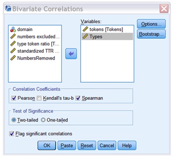
20. From the scatter plot, we can suspect a positive linear correlation between tokens and types. To assess the strength of this correlation, we will compute both the Pearson product-moment correlation coefficient (r) and the Spearman Rank Order Correlation coefficient (rho) for this correlation (for the difference between the two, see Dörnyei, p. 230). ?How: Analyze → Correlate → Bivariate. Select Tokens and Types as the Variables, Pearson and Spearman for the Correlation Coefficients, and two-tailed for the Test of significance. Within Options, choose Exclude cases pairwise for Missing Values. ?What to look for in the ouput: See Dörnyei, pp. 223-227. You should basically look for two sets of value (which will be fairly similar for both the Pearson Correlation r and Spearman’s rho results): 1) the correlation coefficient, which will give you an indication of the strength of the correlation, and 2) the Sig value, which will give you an indication of how significant the correlation is. If you find a significant correlation, to assess the effect size of this correlation, you should calculate the square value of the correlation coefficient, which is the amount of variance that is explained by the correlation. For example, if r = 0.5, then R2 = 0.5x0.5=0.25, which means that the correlation explains 25% of the variability in your data (see Dörnyei, p. 224). ?
Include the scatter plot in your report, with a figure caption and a brief commentary.
Report your correlation results. No need to include a table: Just embed your correlation coefficients in the main text (as shown in Dörnyei, p. 227).